

We are delighted to be working with Mylands paint as a Fair Partner. Established in 1884, Mylands is Britain’s oldest family-owned and run paint and polishes manufacturer. They have been perfecting the art of fine, richly pigmented paints with real depth of colour for over 135 years. Their superior performance paints are water-based with a low VOC, and kind to the environment. They have held the Royal Warrant since 1985. Mylands paint is used around the Decorative Fair on the public space walls, and on many of the dealers’ stands.
Mylands recently introduced a new range: The Archive Collection features 12 historic colours, all of which work well with antiques and period design. They compliment contemporary art as well as more traditional decoration, and are chosen from the company’s extensive colour archives in a celebration of Mylands’ heritage and colour legacy. The Archive Collection is rooted in the past, but with a timeless appeal that makes each paint perfectly suited to modern interiors.
The Mylands archive contains countless bespoke colours developed for clients over its long history of manufacturing the highest quality paints for use in the home, and in film, television and theatre productions thanks to a longstanding relationship with the industry. The Archive Collection consists of carefully selected colours from these extensive libraries that each stand out due to their individual character and tone. The collection also includes selected colours from the British Colour Council, an industry standards organisation during the 1930s-1950s whose original books are in the Mylands archive.
Each selection is beautifully characterful and is sure to bring a stunning depth and sense of joy to a space. Read more about each paint below, or browse the collection here.

GENTLEMAN’S PINK ™ No. 221
A pastel pale pink with a drop of red and violet, Gentleman’s Pink™ No.221 is inspired by an English gentlemen’s shirt, and whilst a subtle shade, it is packed with character.
_Hoxton Grey No.72 (Woodwork)_Mylands_Hallway_Portrait_2")
PEACH FLESH PINK™ No. 268
Peach Flesh Pink™ No.268 is a fresh, peachy shade, shown here on the hallway wall, that is both punchy but delicate and incredibly versatile, containing yellow oxide and bright red pigment.
_Living Room_Detail_2_Archive Collection_Mylands_2021")
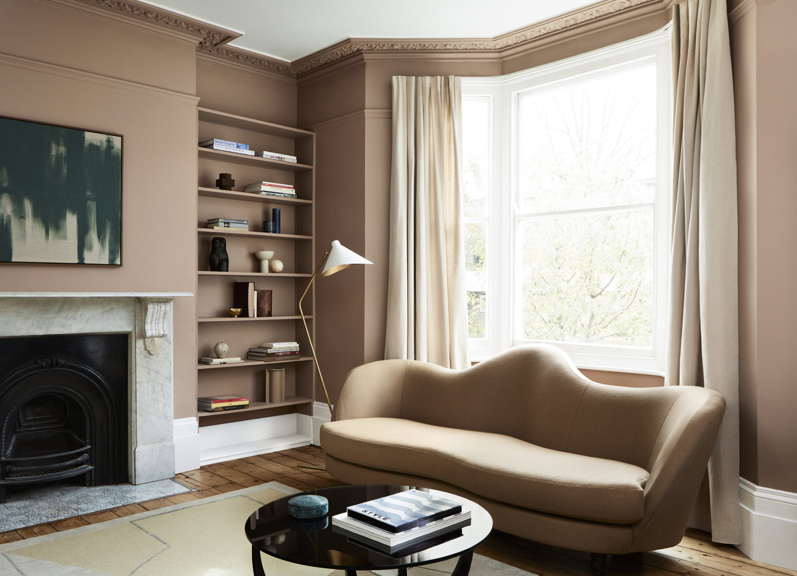
EGERTON PLACE™ No. 297
Living room walls and shelving are here painted in Egerton Place™ No. 297, a deep, earthy mushroom pink of umber and red with a touch of black. This bespoke colour was originally created for an attractive period property on the eponymous and sought-after West London square.
_Office_Detail_Archive Collection_Mylands_2021")
Inspired by the perennial herb, bring elements of the outside world in with this vibrant botanical green. Containing bright yellow, umber, and a touch of white.
_Living Room_Portrait_Archive Collection_Mylands_2021")
PLEASURE GARDENS GREEN™ No. 214
A dark green containing red with a drop of violet to deepen the tone. Pleasure Gardens Green™ No.214 is named after the leafy Vauxhall gardens on the south bank of the River Thames and just a stone’s throw from Mylands’ original store (and not too far from Battersea Park!).

ROSE TAUPE™ No. 292
With a vintage feel, a deep brownish grey containing bright yellow, red and black pigment. This warm shade, originally from the British Colour Council, is both a timeless neutral yet rich and atmospheric. It has also been chosen by Mylands as their Colour of the Year 2022. The warm grey shade is a dream to work with – it pairs easily with many colours, from the softest pinks and blues to matt black. It complements cool or warm shades, making it a favourite choice for discerning decorators.

EMPIRE VIOLET™ No. 80
Empire Violet™ No. 80 is a regal, jewel-like dark purple of red, umber, and black. This statement hue from the British Colour Council creates both intimacy and drama in any room.

BEEHIVE PLACE™ No. 140
Combining umber, green and white to form a bright sunshine yellow, Beehive Place™ No. 140 is named after the street of the original 1884 Mylands store. This colour is warm and muted yet bold enough to make a statement.
_Proper Blue 67_(Staircase)_Gentleman s Pink 22_(Wall)_Peach Flesh Pink 268_(Dado)_Archive Collection_Mylands_2021_1")
CORAL ORANGE™ No. 277
The dining room walls here are painted with Coral Orange™ No. 277 a colour reminiscent of underwater coral marine life. Bright red and yellow come together to form a vibrant and muddy orange shade full of optimism.

RED POST HILL™ No. 68
Named after a South London road, Red Post Hill™ No. 68 is a classic post box red containing a mix of six pigments: bright red, magenta, violet, black, yellow, and white.
_Sorrel Green No.207 (Woodwork)_Cotton Street No.3 (Walls)_Hallway_The Archive Collection_Mylands_Landscape_3")
PROPER BLUE™ No. 67
A bold and energetic deep cobalt blue of green, violet, and black. Evoking an ocean of endless depth whilst still appearing tranquil and still, Proper Blue™ No. 67 pairs beautifully with almost any colour scheme. (The woodwork here is painted in Sorrel Green.)

A richly pigmented light and bright blue. A combination of white, black, and violet form a striking and serene shade.
Explore the world of colour at Mylands.


